
A dimensional letter is a structural object that happens to be shaped like typography. That is the whole discipline in one sentence, and it is the part most briefs skip: by the time a logo leaves the brand guidelines and becomes something a guest can stand next to, it has weight, a center of gravity, a wind profile, a finish that behaves a particular way under light, and a plan for getting through a freight door. Dimensional letters fail in public when they are treated as graphics that simply got thicker.
They are also among the most photographed objects we build. A guest will walk past a beautifully detailed scenic wall and stop at a six-foot letter, because a letter gives them something to stand beside, lean against, or frame themselves within. That makes a logo build disproportionately valuable per square foot of activation footprint — and disproportionately unforgiving, since every seam, every fingerprint, and every wobble lands at eye level in someone else’s photograph.
What follows is how our shop approaches dimensional letters: choosing the material, sizing the letter for the room rather than for the drawing, lighting it, keeping it upright, and moving it without damage.
A Logo Build Is Not Signage With Depth
The category covers more than freestanding letters. It includes wall-mounted logotypes, back-lit marks, letters that double as furniture, and monograms cut into a surface so the material itself carries the brand. What unites them is that the brand asset becomes a fabricated object with tolerances, and tolerances are where logos get lost.
Typefaces are drawn as outlines with no thickness. The moment you extrude one, decisions appear that the brand book never answered. How does the counter of an a resolve when the face is an inch and a half proud of the wall? Does the crossbar of a t carry its own return, or die into the stem? At what radius does a mitred corner stop reading as sharp? Our drawings settle those questions before anything is cut, because the alternative is a fabricator settling them silently on the shop floor.
This is also where an honest conversation about fidelity belongs. A logo built at two feet tall can hold every detail of the original artwork; the same logo at twelve feet may need its thinnest strokes thickened to stay structurally sound. That is a brand decision, not a shop decision, so we raise it as a drawing revision rather than discover it at install.
Choosing the Material for the Distance and the Duty
Material selection for dimensional signage comes down to two questions: how close will a guest get, and what is the letter being asked to survive?
Foam and Composite
Cut foam, hard-coated and finished, is the workhorse for letters that read at distance and need to be light enough for two crew members to carry up a service stair. It takes a faux finish convincingly, it can be built at heights that would make a solid letter unmanageable, and it can be sectioned and keyed for transport. Its weakness is contact: bare foam bruises under a shoulder bag and shows every knock along a traffic path. Where guests will touch a foam letter, we specify the hard coat and finish accordingly rather than hoping the crowd behaves.
Acrylic
Acrylic earns its place when light has to move through the letter rather than bounce off it. Laser-cut and layered, it gives you edge glow, translucency, and a color depth that paint cannot reach. It is also the least forgiving material in the shop for fingerprints and micro-scratches, which is why we treat cleaning as part of the install plan and not as a courtesy at the end.
Metal and Mirror
Metal is what you choose when the letter should feel like an object with provenance. A cast or machined face carries a weight in photographs that no coating imitates, and it holds a polished, brushed, or plated finish for the whole run of an event. On the basketball-themed milestone at Cipriani that we designed and fabricated as Josh Do It, the back bar carried a cast-aluminum logo finished in gold, set against a CNC-fabricated metal grate textured with basketball lines — the mark reading as hardware rather than as applied graphics.
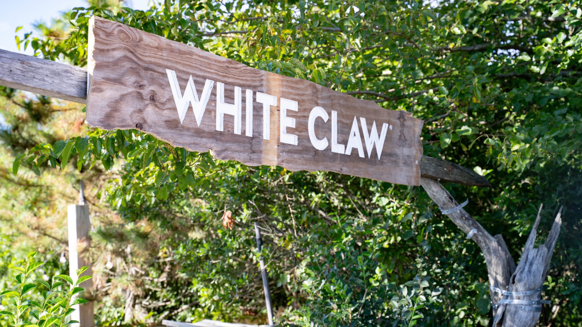
Mirror finish is its own strategy. A mirror-faced letter borrows whatever is around it, so it changes through the day and photographs differently every hour. For White Claw Sessions at The Surf Lodge in Montauk, we fabricated, produced, and installed mirror-finish WHITE CLAW letters standing on the sand at the edge of Fort Pond, where the faces picked up water, sky, and the crowd itself. The same project carried a reclaimed-wood WHITE CLAW entrance sign — the reverse argument, where a material with visible history does work a polished face cannot.
Wood and Reclaimed Stock
Wood reads as warmth and permanence, and reclaimed stock reads as place. It is heavier than foam, more stable outdoors than acrylic, and it accepts a finish that ages honestly over a season-long install. It is also the material most likely to move with humidity, so joinery and letter spacing have to allow for it.
Size the Letter for the Sightline, Not the Elevation Drawing
A logo build is sized by where people will stand, not by what looks balanced on a page. Signage shops work to a rule of thumb of roughly one inch of cap height for every ten feet of comfortable reading distance, and it is a useful floor. For an activation, though, legibility is only half the brief. The other half is whether a guest and the letter fit in one frame.
That second test changes the answer. A letter tall enough to read across a ballroom may be too tall to photograph with a person beside it unless the guest backs up further than the room allows. We work the sight line in both directions: the longest view, where the mark has to announce itself, and the closest view, where a phone held at chest height needs the whole word and a human in the same shot.
Three practical checks earn their place in every logo build:
- The approach view. What does the letter look like from the door, at an angle, with a crowd in front of it? Letters designed only in flat elevation often crowd into one another when seen at thirty degrees off axis.
- The frame test. Stand where a guest will stand, arm extended, and confirm the word and a person coexist in the shot without the top of the letter cropping.
- The background. A mark loses its edges against a busy surface. Either the letter carries its own contrast or it needs a plane behind it to sit against.
Lighting Decides Whether the Build Reads
Dimensional letters are shaped by shadow, so the lighting decision is a fabrication decision. It belongs in the same conversation as the material, not in a separate lighting pass after the shop has already committed.
Internally lit letters carry their own brand presence and hold it regardless of what the room does. On the custom-fabricated trade show booth we built for Netflix at the Meadowlands Complex, a branded LED logo served as the centerpiece of the build — the one element that stays legible whether the hall is lit to camera or lit for aisle traffic. A show floor is an argument between exhibitors about brightness, and a letter that generates its own light does not have to enter it.
Halo lighting, where the source sits behind the letter and throws a glow onto the surface behind it, buys elegance and separation at once. It also depends on a precise standoff distance and a clean, consistent gap, which means the mounting has to be fabricated to tolerance rather than shimmed on site.
Externally lit letters are the most common and the most often misjudged. A grazing angle rakes light across the face and makes texture into an asset; a flat frontal wash erases the same texture and turns a built letter into a decal. Mirror and gloss faces add a further constraint, since they reflect the fixture itself if the angle is wrong. We resolve that on paper, then confirm it in the test fit with the actual fixtures rather than with a placeholder.
Bases, Ballast, and Standing Up Outdoors
A freestanding letter is a sail with a signature on it. Any face big enough to photograph is big enough to catch wind, and freestanding dimensional letters need a considered answer to what holds them down.
Indoors, the answer is usually a weighted base concealed within the letter’s own footprint, or a cleat system that ties the piece back to a scenic wall. The discipline is keeping the solution invisible: a visible bracket is the detail that pulls a photograph from environment to equipment. Where a venue will not accept anchors, free-standing and self-ballasted is the only honest route, and that has to be designed in rather than solved with sandbags at load-in.
Outdoors, the ground makes the decision. Sand takes no fixings, shifts under load, and demands a spread footing sized for the face area of the letter. Turf, deck, and paving each behave differently, and each one changes the base. Rain is part of the same conversation, because a letter that stays up in a gust and fails in a downpour has not been engineered — it has been guessed at. We size for the worst plausible hour of the install, not the average one.
One question settles a great deal of this early: is the letter meant to be touched, climbed on, or leaned against? Guests treat large letters as furniture whether or not they were designed as furniture. Knowing the answer before fabrication is the difference between a piece that endures a crowd and a piece that gets quietly moved back against a wall halfway through the night.
Transport, Install, and Strike
The freight elevator is the real design constraint on a Manhattan logo build, and it is the first measurement we take. A letter is sectioned, keyed, and crated to the smallest envelope in the path — door, corridor, elevator, turn — and every section is labeled to the install drawing so the crew is not solving a puzzle on the clock.
Joint placement is a design decision, not a shipping one. A seam that falls across the shoulder of an S announces itself in every photograph; the same seam placed inside a stem disappears. We make that call in the shop drawings and confirm it in a test fit, so the letter is assembled once before it is assembled under time pressure at the venue.
Finish repair travels with the build. Touch-up matched to the run, the correct cleaner for the face material, and lint-free cloths belong in the crate, because a mirror or acrylic letter is handled repeatedly during assembly and will arrive at doors covered in evidence of it. On event day, a member of the crew owns the faces: one pass before guest arrival and one at the turn between daylight and evening lighting.
Strike deserves the same drawings as install. Dimensional letters come apart in a known sequence, back into the same crates, with protection reused rather than discarded — which is what keeps a piece available for a second market instead of a single use.
How to Brief a Shop
The briefs that produce good logo builds share a shape. They provide vector artwork rather than a raster image, because a shop cuts from paths. They state the intended viewing distance and the intended photograph. They identify the venue and its restrictions, particularly whether anything may be anchored. They say whether the piece lives for one night or one season, indoors or out. And they name the one letter or mark that has to be perfect, because that is where finish attention concentrates.
Everything past that is a conversation between drawing and material, which is the conversation our event fabrication shop exists to have. When a logo build is part of a larger environment, the letters get drawn alongside the scenic rather than after it — on the VTEX corporate event at The Glasshouses we produced for more than 350 guests, the dimensional signage was designed with the steel framing and industrial-finish surfaces around it, so the brand read as part of the architecture instead of as an addition to it. That integration is what separates a built brand environment from a room with a logo in it.
Dimensional letters reward the projects that treat them as architecture: drawn properly, engineered for the ground they stand on, lit deliberately, and finished for the distance a camera will actually get. If you have a mark that needs to exist at scale — for a brand activation, a booth, a launch, or a celebration — tell us about the project and we will tell you honestly what it takes to build it, what compresses, and what does not.