
A brand activation is photographed before it is understood, and the photograph is the thing that travels. Whatever you build has to survive a vertical frame shot from four feet away by a guest who never read the creative brief, in whatever light the room happens to have at 7:40 in the evening. That is a fabrication problem at least as much as a design one, and it is the reason so many good concepts arrive on site and quietly fail to register.
The brand activation ideas that hold up share a structural logic rather than a style. They give a guest a reason to stop, a clear place to stand, and something behind them worth the frame. What follows is twelve of them, grouped by the build principle that makes each one work. None of them is a mood board entry. Each one has shop drawings, a weight, and an install sequence underneath it.
Scale: Build Past the Height of the Guest
The fastest way to make an object photographable is to make it taller than the person standing next to it. Once a build breaks the horizon of a phone held at chest height, it stops competing with the crowd behind it and starts framing the shot on its own.
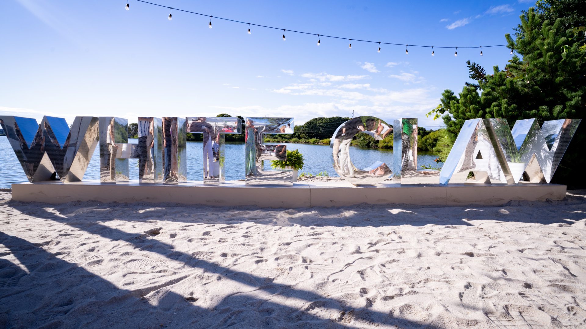
1. Freestanding dimensional letters in open landscape. Letters that sit on the ground rather than on a wall read as architecture. For White Claw Sessions, the brand’s summer takeover of The Surf Lodge in Montauk, our shop fabricated and installed mirror-finish WHITE CLAW letters standing directly on the sand at the edge of Fort Pond. Out in the open, with water behind them, the letters have no wall to borrow scale from, so the letters have to supply it themselves — which means bases, ballast, and a footing plan drawn long before anything leaves the shop.
2. Walk-through architecture instead of a backdrop. A structure a guest can enter produces a different picture than one they stand in front of, because the frame fills with built environment on all sides. The two-story Barbie Dream House we built inside Cipriani is the clearest version of that idea: a fully realized, walk-through structure engineered as a modular, self-supporting steel and wood assembly, pre-fabricated in our NYC shop and test-assembled before it was ever delivered. The scale is the concept. Everything else is engineering in service of it.
Reflection: Let the Site Do Half the Work
Mirror is the most efficient material in brand activations because it imports the surroundings into the object. A mirrored surface on a beach is sky and water; the same surface on a street is the streetscape. You get a second set for the cost of a finish.
3. A mirrored façade that re-skins a building. For the Delilah collaboration with Chase in Montauk, we clad an entire street-facing façade in mirror as a paneled cladding system fabricated in the shop and installed over the existing exterior, with a ground-up new entrance built alongside it. Treating the whole frontage as one re-skin rather than a set of applied pieces is what makes it photograph as a building rather than as decoration hung on a building.
4. Reflective hero objects placed against open sky. Reflection needs something worth reflecting. Mirror-finish work indoors under a low ceiling mostly returns the ceiling. The same finish outdoors, angled slightly downward toward the guest, returns light and horizon. Angle is a drawing decision, not a site improvisation, and it belongs in the elevation before the panels are cut.
Framing: Tell People Where to Stand
Most guests will not compose a shot. They will stand where the build tells them to stand. An explicit frame removes the decision, which is why framing devices consistently out-perform prettier objects with no obvious front.
5. An oversized frame as the whole idea. On the waterfront deck at The Surf Lodge, the Sessions build included an oversized white photo frame scattered with the brand’s colored can tabs — a device that does nothing except tell two people where to put themselves and what the picture is about. The can tabs carry the brand at close range; the frame carries it at distance.
6. A portal that separates the guest from the room. An aperture the guest passes through, or stands inside, isolates them from the venue behind. This is the principle that makes a busy room usable for content: the frame edits out everything you did not build. Study the sight line from where the queue will actually form, not from the render’s camera position, and you will find the frame needs to be lower and wider than the drawing suggests.
Light and Contrast: Design for the Sensor, Not the Eye
A phone camera has far less range than the eye. It cannot hold a bright light source and a dark surface in the same frame, and it will resolve the argument by crushing whichever one you cared about. Build contrast deliberately or the camera will invent it.
7. Luminous line work as the graphic. Light drawn as a line photographs better than light thrown as a wash, because the line survives compression and the wash does not. At a basketball-themed milestone at Cipriani we rigged a 28-by-20-foot LED court outline from the ceiling as a truss-and-LED structure, with a four-inch luminous line tracing a regulation court above the room. It reads instantly overhead and it reads in a photograph taken from the floor.
8. Layered translucent material with light behind it. Acrylic layered in depth gives a camera something to focus through. One Love, the Pride Month installation we designed and fabricated for One World Observatory, is a twelve-foot-wide by eight-foot-high laser-cut acrylic sculpture: layered translucent buildings, a rainbow color progression across a stylized New York skyline, One World Trade Center featured within it. Commissioned by the marketing team for the One World Trade Center complex, it held up to visitors throughout the month — a useful reminder that a month-long install is a durability specification as much as a design one.
Objects and Props: Brand at Walking Speed
The strongest brand activation ideas are rarely a single hero object. Not every element needs to be a photo moment. Some of them exist to carry the brand through the parts of the footprint where nobody is stopping, and to lead people toward the places where they should.
9. Branded props as wayfinding. At White Claw Sessions the custom Sessions surfboards at the entrance and around the property did the work of signage without looking like signage, alongside a reclaimed-wood WHITE CLAW entrance sign. A prop that belongs to the place it is standing in reads as hospitality; the same prop in the wrong material reads as advertising.
10. The bar as the most photographed object in the room. Guests come to the bar regardless, which makes it the highest-traffic surface you will build. For the same basketball milestone, our shop built a 24-foot front bar fronted with more than ninety mounted regulation basketballs, and a CNC-fabricated back bar in basketball-line-textured metal grate carrying a cast-aluminum logo finished in gold. The bar earns its complexity because everyone in the room ends up standing at it.
Throughput: An Idea That Cannot Move People Is a Bottleneck
Brand activation ideas are usually judged on the render and killed by the queue. A single-file photo moment with a three-minute dwell time will serve a fraction of a large crowd, and the rest of the guests will experience it as a line.
11. Split service from the experience. Our 40-by-20-foot build for Café de Colombia at the San Diego Convention Center separated an integrated full-service coffee bar, built to retail operational standards, from two dedicated tasting environments, with concealed back-of-house storage behind both. Service moves at one speed and tasting at another; giving them separate zones is what let the footprint serve a show floor of more than three thousand attendees.
12. Give the moment more than one face. A build with two or three usable sides serves several groups at once and halves the queue without doubling the fabrication. Plan the guest flow in the same drawing as the object: where the line forms, which direction it faces, and where a guest goes after the photograph. Throughput is a design constraint, and treating it as an afterthought is how a strong idea becomes the worst part of the evening.
What Turns an Idea Into a Build
Every concept above becomes real in the same handful of steps: drawings, engineering review, shop build, finish, test fit, transport, install. The concepts that fail usually fail because one of those steps was assumed rather than scheduled. A render does not carry a load path, and a mood board does not tell a crew where the freight elevator is.
Venue conditions decide more of the design than most briefs admit. On the West Terrace rooftop at the Moxy in midtown, eighteen floors up, our seasonal transformation into Magic Hour Mountain Lodge used shop-built faux log cabin walls finished to read as timber from phone-camera distance, installed without modifying the rooftop at all. Reversibility was the constraint that shaped the whole approach — as it was for the NYLON Nights Fourth of July celebration at The Surf Lodge, where we fabricated and installed a series of premium branded activations at key touchpoints, integrated into the venue rather than imposed on it.
Finish thresholds matter in the same practical way. A surface only needs to convince at the distance guests actually see it from, and knowing that distance is what tells the shop where to spend the hours. That judgment sits at the center of event fabrication, and it is why content capture belongs in the conversation during design development rather than after load-in.
The best brand activation ideas are the ones drawn with the truck, the elevator, the crowd, and the camera already in the room. If you have a concept and want to know what it takes to build it — or you want help finding the version of it that will actually photograph — tell us about the project and we will walk through it with you. We design, fabricate, produce, and install brand activations out of our own shop, which means the answer you get about what is possible is the same answer the crew works from.