
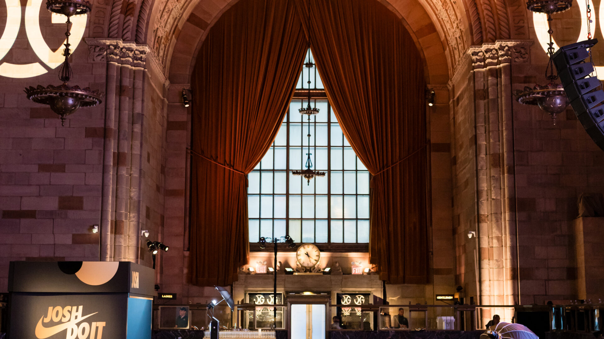
Most of the people who will see your event were not in the room. They will see it as a vertical clip shot at chest height, watched without sound, on a screen the size of a hand. That is the real audience, and it changes what a room has to do. Event design for social media is not a filter applied after the fact or a hashtag printed on a step-and-repeat; it is a set of decisions made in the ground plan and the shop drawings, weeks before anyone arrives.
The gap between a room that looks extraordinary in person and a room that photographs well is wider than most briefs admit. The eye corrects for mixed light, ignores clutter at the edges of its field, and reads depth the lens flattens. A phone does none of that. Designing for the camera means building a second room inside the first one: the room the sensor can actually see.
The Camera Sees a Narrower, Flatter Room
A guest standing in your venue perceives roughly 180 degrees of peripheral information, continuous focus from two feet to the back wall, and a dynamic range that handles a candle and a window in the same glance. A phone camera sees a fixed rectangle, compresses depth, blows out highlights, and crushes shadow detail into grey mud.
Everything that makes a room feel designed in person — the slow reveal as you walk in, the layering of near and far, the subtle shift from warm lounge to cool bar — collapses in that rectangle unless you build it to survive the collapse. Depth has to be declared, not implied. Contrast has to be constructed, not ambient.
This is why a build that photographs well often looks slightly overbuilt in person at first glance. The scale is a half step larger than the room strictly needs, the edges are harder, the color separation is more deliberate. That is not excess. It is compensation for a lens that throws away two-thirds of what the eye collects.
Sightlines Now Come in Two Sets
Every ground plan already carries guest sightlines: where people can see the stage, where the bar reads from the entrance, where a column blocks the view of the band. Camera-first design adds a second overlay. Where will people actually stand to shoot? What is behind the subject when they do? What walks through the frame?
Work it the way you would work any other sightline problem. Pick three or four likely shooting positions — the entrance threshold, the bar rail, the edge of the dance floor, the seat at the end of a long table — and draw the cone of what each one captures. Then look at what is in those cones. Almost always it is something nobody designed: a service door, a stack of empty cases, a fire extinguisher, the unfinished back of a scenic wall.
The fix is rarely expensive and almost always structural. Rotate a bar fifteen degrees so the back bar, not the service station, sits behind the subject. Move the branded wall off the long axis so people shooting it are not also shooting the kitchen entrance. Give the scenic a finished reverse side when the plan puts guests behind it. These are drawing-stage decisions; they cost nothing then and cost a great deal on install day.
The flip side matters just as much. A crowd that gathers to shoot one object becomes an obstacle in the guest flow, and a photo stop placed in a corridor will stall the whole room within the first hour. Shooting positions want their own pocket of floor, out of the main circulation path, with enough standoff distance that the whole object fits in frame.
Contrast Is What Survives Compression
Video compression is brutally simple about what it keeps. Hard edges and strong tonal separation survive; subtle gradients and close-value neighbors turn to noise. A tone-on-tone palette that reads as refined restraint in the room reads as a flat grey smear in a clip watched at speed.
Build contrast into the materials rather than correcting for it in post. Three kinds do the most work:
- Value contrast. Dark object against light ground, or the reverse. A matte black surface in front of a bright wall holds its shape at any resolution.
- Texture contrast. Rough against smooth. Reclaimed timber beside polished metal separates even when the colors are close, because the two surfaces return light differently.
- Specular contrast. A reflective surface next to a matte one. Mirror and brushed finishes carry highlights that the sensor registers as structure.
The mirror-finish WHITE CLAW letters we fabricated, produced, and installed on the sand at Fort Pond for the White Claw Sessions takeover of The Surf Lodge work on exactly this principle. Mirror on sand under open sky is maximum specular contrast against a soft, low-contrast ground, and it changes with the weather and the hour without anyone touching it. The oversized white photo frame on the waterfront deck does the same job with value instead of reflection: a hard white rectangle isolating whatever stands inside it.
Color behaves the same way. The laser-cut acrylic sculpture we designed and fabricated for One Love at One World Observatory uses a rainbow progression through layered translucent buildings — saturated hues in a deliberate sequence, each one separated from its neighbors. Saturation survives compression. Pastel adjacency does not.
Light for the Sensor, Not Only for the Eye
Lighting is where the most beautiful rooms fail the camera. Three problems recur, and all three are solvable in the plot.
Mixed color temperature
A phone sets one white balance for the whole frame. Put a warm tungsten wash on the scenic, a cool LED on the bar, and whatever the venue’s house downlights are running, and the camera will pick one and render the other two as a color cast — faces going orange or corpse-green depending on which source wins. Decide the color temperature of any area where people will shoot and hold every fixture in that area to it. Variation belongs between zones, not inside a single frame.
No light on faces
Most event lighting is designed for objects and architecture. It lands on tables, walls, florals, and the stage. In a photo, the object is lit and the person in front of it is a silhouette. Any surface meant to be stood in front of needs a soft frontal source at roughly face height — a low-intensity wash from the front, not a downlight that carves eye sockets into shadow.
Flicker and refresh
Inexpensive dimmed LED fixtures pulse faster than the eye can register but slower than a phone’s rolling shutter, which records the pulse as rolling bands across the frame. Any fixture in a primary shooting zone should be specified as flicker-free and tested on camera at the dimmer levels you plan to run, not only at full. Our production team checks this during focus, with a phone, because the phone is the instrument that matters.
Lighting that is built for the lens often feels gentler in person than a conventional plot: fewer hot pools, more even frontal fill, a tighter temperature range. That is a trade worth making when the reach of the night depends on what leaves it on a camera roll. We treat it as a core part of experiential event design, not as a correction applied at the end.
Give the Frame Something That Moves
A still photograph can carry a static object. A clip needs change, or the viewer scrolls at second two. Motion is the cheapest content advantage a built environment can hold, and it does not require anything mechanical.
Suspended objects drift and rotate on their own. Reflective surfaces change as the shooter moves. Light that shifts across a cycle gives two clips taken ten minutes apart different character. Scale that forces a tilt or a pan — an object too tall to fit in one frame — makes a camera move part of the shot.
The LED court outline we designed and fabricated for a basketball-themed milestone at Cipriani is a clean example: a 28-by-20-foot regulation court traced in a four-inch luminous line and rigged overhead from truss. Nothing about it moves, but it is impossible to capture in a single static shot from the floor. Every clip of that room has a camera move built into it, because the object is bigger than the frame.
The Clip Is a Sequence, Not a Frame
The piece of footage that actually travels is rarely one locked-off shot. It is an arrival, a reveal, and a detail, strung together in under half a minute. That sequence is where event design for social media stops being a graphics question and becomes a floor-plan question.
Arrival wants a threshold: a defined edge where the ordinary world stops. Reveal wants one object the room is organized around. Detail wants something at hand height that rewards a close shot — a surface finish, a piece of signage, an object with real texture in it.
The Aspen-inspired rooftop we designed, fabricated, and installed as Magic Hour Mountain Lodge at the Moxy was built to carry all three, eighteen floors above midtown. The faux log cabin walls around the dining tables were finished to read as timber at phone-camera distance, which is the only distance that matters for the wide shot. The décor wall of bighorn antlers, cowboy boots, ropes, and faux snow is the detail layer: a dozen close shots available in a few feet of wall. Behind both, the city stays visible — the one element no build can manufacture.
Plan where each beat of that sequence happens and how long a guest can stand there. A reveal in a bottleneck produces a queue; a detail wall across from the restrooms produces nothing at all. Content capture works best when the room gives it space on purpose.
What It Means for the Build
Camera-first design pushes real requirements into the shop, and they are worth naming because they drive the drawings.
Finish thresholds tighten. The forgiving rule of scenic — it only has to read from fifteen feet — stops applying when a lens will be eighteen inches from the surface. Any area inside the detail-shot radius gets the finish quality of a retail fixture, not a backdrop.
Backs and edges become visible surfaces. A frame guests can walk behind has no back. Reveals get finished returns, cable gets dressed and concealed, and the ballast under a free-standing letter gets a skirt or a buried base rather than exposed steel in frame.
Durability moves up the specification. Anything people pose with gets touched: leaned on, climbed on, picked up. A custom surfboard standing at an entrance and a décor wall of boots and ropes at arm’s length are objects guests will reach for, and they have to be specified that way from the first drawing. This is ordinary practice in event fabrication, but it only happens when the brief says out loud that the piece will be photographed with people touching it.
None of this is a style. It is a reading of where the audience is. Event design for social media simply accepts that the room has two audiences — the several hundred people inside it and the far larger number who will meet it through a rectangle — and builds for both at the same time.
If you are planning a build where the footage matters as much as the night, we would rather work the camera positions into the ground plan than retrofit them on site. Tell us what the room has to do, and we will show you where the frames are before anything gets cut.