
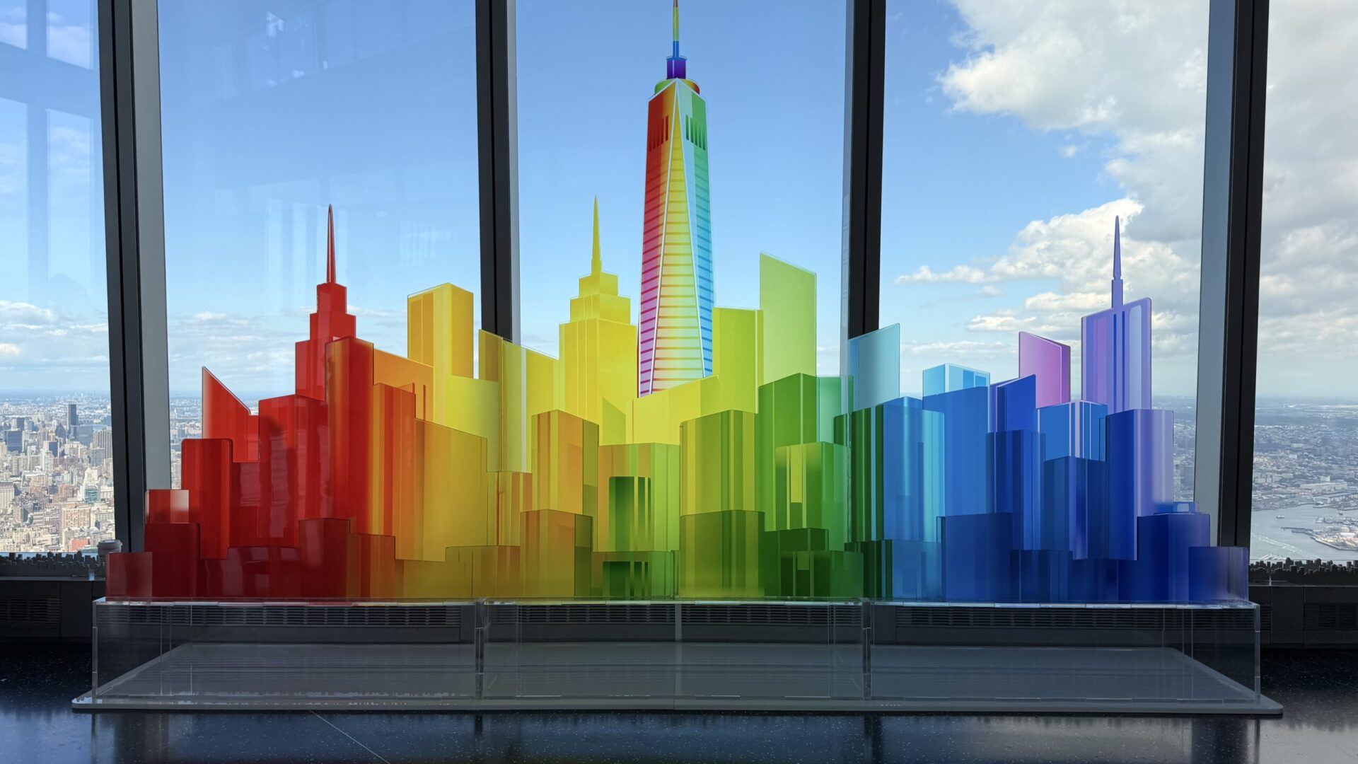
A Pride Month activation is a month-long public installation, not an event build, and that single distinction should govern every decision that follows it. An activation made for one evening can lean on a crew standing just out of frame, a venue that resets overnight, and finishes that only have to survive a few hours of polite handling. An installation that lives in a lobby or on an observation deck through all of June has none of those protections. It has to hold its line against thousands of hands, moving sun, nightly cleaning, and the slow wear of being treated as architecture rather than as décor.
That is the shift most Pride programs either make or miss. Brands brief the work as a moment and then discover in week two that the moment has to keep performing for twenty-eight more days, in a space they do not control, in front of an audience that did not come for the brand at all. The design question is not how to look celebratory. It is how to build something whose meaning and whose materials both survive the month.
Duration Is the First Engineering Constraint
Everything about a month-long build is decided by contact. In a one-night environment, a guest sees a structure, photographs it, and moves on. In a public installation, a guest leans on it, sets a bag against it, lets a child push on the lower panels, and comes back the following week. The lower three feet of any public piece is a different engineering problem from the rest of it, and we detail it that way: tougher substrate, harder coatings, fasteners reached from the back, and a finish that can be wiped without clouding.
Sunlight is the other clock running against the build. A south-facing lobby window will shift the color of an unprotected pigment over a few weeks, and it will do it unevenly, which is worse than doing it uniformly. Translucent material handles this better than printed graphic, which is one of several reasons meaning in a long install is better carried by the material itself than by something applied to its surface.
Maintenance belongs in the drawing set, not in the recap. Before anything leaves our shop for a month-long placement, we work out how it gets cleaned, who can clean it without damaging it, which components are expected to wear, and how a worn component comes off and goes back on without the whole piece coming down. A build that cannot be serviced in place is not finished being designed.
Meaning Is Built Into the Structure, Not Applied to It
The weakest Pride work treats the rainbow as a sticker. Color goes onto a surface that would otherwise have been white, and the result reads as a brand borrowing a symbol for thirty days. The strongest work treats color as a structural system, where the progression is the reason the object has the shape it has, and removing the color would leave you with nothing.
Our One Love installation at One World Observatory was built on that principle. Commissioned by the marketing team for the One World Trade Center complex, it is a twelve-foot-wide by eight-foot-high photo activation: a custom laser-cut acrylic sculpture of layered translucent buildings carrying a rainbow color progression across a stylized New York skyline, with One World Trade Center itself featured in the composition. The color is not painted on the skyline. The color is what the skyline is made of, layer by layer, and it engaged visitors throughout Pride Month because it held up as an object even before anyone read it as a message.
That is the test worth applying to a concept at the sketch stage. Strip the palette out and look at what remains. If the form still means something, the color will amplify it. If the form was only a carrier for the palette, the piece will photograph as a backdrop, and a backdrop cannot sustain a month of attention.
Scale Is How a Public Room Gets Organized
Public installations compete with buildings. In an observatory, a concourse, a hotel lobby, or a terrace, your piece is in the same field of view as architecture that is permanently winning on scale, so the object has to be large enough to register as intentional from across the room and resolved enough to reward a guest who walks up to it. Pieces that fail usually fail in the middle distance: big enough to notice, too small to approach.
Scale is not the same as footprint, and the distinction matters when you are negotiating with a building. A tall, thin, vertically layered piece can command a volume of space while standing on a modest activation footprint, which is often the only way to get a meaningful installation approved in a circulation route. We would rather build upward, with ballast engineered into the base, than spread sideways into the path of a fire exit or a sightline the venue has already promised to someone else.
Height is also how a public piece survives crowds. Detail placed above shoulder level stays readable when forty people are standing in front of the work, and it stays undamaged because nobody can reach it. Detail placed low is detail you are agreeing to repair.
Light Through the Material, Not Onto It
Lighting a Pride Month activation by pointing fixtures at it is the default, and it is usually the wrong instinct. Front light flattens a layered form, throws the shadow of every guest onto the piece, and turns a translucent material into an opaque one. A build conceived in layered acrylic wants to be lit from within and behind, so that each layer glows at a slightly different depth and the color progression reads as an atmosphere rather than as a printed gradient.
Acrylic rewards this treatment more than almost any other material we work in. Light entering a cut edge travels inside the sheet and escapes at the next engraved or routed face, which means the geometry of the cut is doing the lighting design. It also means the work has to be laid out with light paths in mind from the first drawing. Layer order, sheet thickness, edge finish, and the gap between layers all change what the eye sees, and none of those are decisions you can make after the sheets are cut.
Venue light is a constraint you inherit rather than choose. A piece on a view floor is sitting inside daylight that changes temperature all day and then disappears into a city glow at night, so the internal lighting has to be strong enough to hold the form at noon and dimmable enough not to blow out a phone camera after dark. Both conditions get tested in the shop, under the brightness extremes the room will actually deliver, before the piece ever ships.
Inclusive Design Is a Production Discipline
Inclusion in this work is largely a set of build decisions, which is the part that tends to get left to the end. A photo moment with a single frontal sweet spot produces one correct way to stand in front of it, and anyone who cannot stand that way gets a worse photograph. A composition that reads from several angles and from seated height produces a piece that works for more people without any signage explaining that it is meant to.
The same logic applies to approach. An installation pressed against a wall with a narrow aisle in front of it forces single-file traffic and makes a wheelchair approach a negotiation with a queue. Pulling the piece off the wall, leaving a clear radius on two sides, and keeping the base free of trip hazards and cable runs costs nothing at the drawing stage and cannot be retrofitted on site. In our experiential event design work these questions sit in the same conversation as sightlines and content capture, because they are the same conversation.
There is also the matter of who the piece is for. Pride installations sit in public space, and much of the audience is not a brand’s customer at all. Work that says something generous and specific holds up over a month in that setting. Work that mostly says a logo tends to be photographed once, ironically, and then left alone.
Installing in a Building That Cannot Be Marked
Most of the venues worth installing in for Pride will not let you touch them, and the ones with landmark status or permanent public operations are the strictest. The answer is the same one we use for any high-sensitivity environment: the piece arrives self-supporting, loads in through the doors and elevators that actually exist, stands on its own weight, and leaves nothing behind. No anchors into a floor, no fasteners into a wall, no modification of a surface that someone else is responsible for.
Public operations add a second constraint that private events do not have. The building is open, so the install happens around visitors or inside a narrow overnight window, which means the work has to be pre-assembled and test fit in the shop and then broken into modules that one crew can carry and reassemble predictably. Our seasonal transformation of the rooftop bar at the Moxy Hotel into Magic Hour Mountain Lodge was designed, fabricated, and installed on exactly that basis: shop-built elements that went in eighteen floors up without modifying the rooftop, and that read correctly from phone-camera distance for a full season.
Outdoor placements raise the stakes again. For White Claw Sessions at The Surf Lodge we fabricated, produced, and installed a branded environment that had to stand on sand at the edge of Fort Pond and keep looking deliberate in wind and salt air. Mirror-finish letters, an oversized photo frame on a waterfront deck, and custom surfboards placed around the property all had to be engineered for the ground they were standing on, not just for the rendering. A piece that would be fine on a lobby floor will tip, sink, or sail on open sand.
Ask the building early for the things that decide the build: door and elevator dimensions, floor loading, available power and where it terminates, who is allowed to work in the space and during which hours, and what the cleaning staff is permitted to do to your finishes. Our event fabrication process assumes those answers arrive before cutting starts, because every one of them changes a detail, and changing a detail after fabrication is the expensive kind of change.
What to Decide Before the Shop Starts
A Pride Month activation has a hard, public deadline that will not move, and the work splits cleanly into decisions that must land early and decisions that can stay open. Lock these first: the placement and its approved footprint, the single form the piece is built around, the material system carrying the color, the lighting approach, and the service plan for the month.
- Placement and approved footprint, confirmed by the venue rather than assumed from a floor plan.
- One primary form, with the color progression integral to it.
- Material and layer strategy, including what gets touched and what is out of reach.
- Internal lighting and power, including where the circuit comes from and who can reset it.
- Maintenance: who cleans it, how, how often, and which parts are consumable.
Messaging copy, secondary graphics, and programming can keep moving later than clients expect. Structure, material, and power cannot. Treating brand activations of this kind as builds first and campaigns second is what keeps a June deadline from becoming a May emergency.
If you are planning a Pride Month activation for next June, the useful time to talk is while the form is still a sketch and the venue conversation is still open, because that is when material, scale, and install are all still free to change together. We design, fabricate, and install this work from one shop, which means the drawings, the build, and the crew that puts it in the room are all answerable to the same people. Tell us about the space and the audience, or start a conversation with our production team, and we will tell you honestly what the month will ask of the build.