
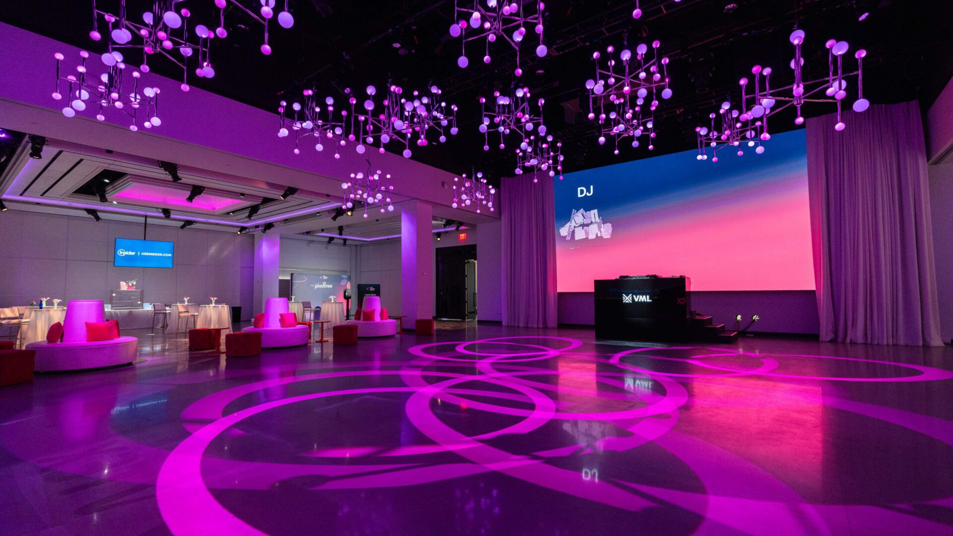
A corporate event becomes brand immersion the moment the room itself starts making the argument the keynote was going to make. Not a logo on a step-and-repeat and not the brand color in the linens, but the architecture of the evening carrying the idea, so that a guest who arrives late and hears none of the program still leaves knowing what the company believes.
Most corporate events stop short of that. They are receptions: a venue, catering, a stage, signage at the entrance, and branding applied as a layer over a room nobody changed. That model is the right call for plenty of gatherings. But it caps what an evening can do, because everything brand-specific about it is removable. Corporate brand immersion is the opposite instinct — the brand lives in the structure, the surfaces, and the light, and it cannot be peeled off at strike without taking the event with it.
The difference is not budget-shaped or taste-shaped. It is a sequencing decision made early, when someone chooses whether the environment is a container for the content or part of it.
Why the Reception Model Caps the Room
A reception is organized around service. Bars go where the plumbing and the back-of-house path allow, rounds go where the room is widest, the stage goes on the short wall, and brand presence collects at the two or three places where guests queue. The logic is operational, and it produces an evening that works and reads as generic.
The ceiling of that approach is recognition. Guests recognize the brand because they read its name in four places. They do not experience it, because nothing about the space behaves the way the brand behaves. A software company that sells precision ends up in a ballroom that says nothing about precision.
Corporate brand immersion raises that ceiling by moving brand expression from the applied layer into the built one. Scenic walls, fabricated surfaces, dimensional signage, and architectural lighting are not decoration on top of the plan — they are the plan. Once that shift happens, the room can argue, and every operational decision after it serves the argument instead of overriding it.
Read the Venue’s Architecture Before You Draw a Floor Plan
The first design move is reading the building. Every venue already has an opinion: a material palette, a structural rhythm, a daylight condition, a ceiling that either wants to be seen or wants to disappear. Designing against that opinion is expensive in effort and reads as a fight. Designing with it makes a modest build feel inevitable.
Our corporate event for the commerce platform VTEX at The Glasshouses in New York worked that way. The venue is glass and steel, and rather than dress over it, we designed custom scenic fabrication in steel framing with industrial-finish surfaces that echoed the architecture the guests were already standing inside. Branded environmental graphics and dimensional signage sat within that frame, and architectural lighting tied the two together. The result read as one environment for 350 or more guests instead of a conference reception with a brand kit stapled to the walls.
This is what a brand environment means in practice: the venue and the build become a single surface. The test is simple. Walk the room with the drawings and ask which elements the architecture is helping. If the answer is none of them, the design is still a layer.
Graphics Belong to the Building, Not to a Signage Package
Corporate branding usually arrives sized for a screen and then gets printed bigger. That is why so much event graphic work feels undersized even when it is physically large — the composition was never drawn for a twenty-foot wall, a forty-foot sightline, or a guest reading it over someone’s shoulder at a distance of four feet.
Large-format graphic environments work differently. The image is composed for the wall it lands on, with the focal content placed where standing eye level actually is, and with the parts that will be blocked by heads, tables, and bar backs treated as field rather than as information. At the private dinner we produced at One World Trade Center, the graphic environments and laser-cut signage were built as architecture for the room, not as posters hung in it.
Dimensional signage earns its place for the same reason. A logo built with depth catches light on its returns, throws a shadow that changes as guests move, and photographs as an object rather than as a flat shape. Flat vinyl disappears under event lighting. Built letters hold.
Light the Room at Human Scale
Lighting is where most corporate environments either arrive or collapse, and the failure is almost always the same: the room is lit from the ceiling down at uniform intensity, which flattens everything the shop spent weeks building and makes faces look worse than they do in daylight.
Immersive rooms are lit in layers at the height people occupy. For the Roivant holiday gala at the Stephen A. Schwarzman Building of The New York Public Library, that meant warm downlighting on the tables where guests were actually looking, amber washes on the lower walls to bring the room’s scale down to something conversational, and restrained uplighting that acknowledged the ceilings without competing with them. The Beaux-Arts interior stayed the hero. The branded elements and custom table designs lived inside it for 400 or more guests without arguing with the architecture.
The practical rule: light the surfaces guests look at, wash the surfaces that set the mood, and treat the ceiling as something to acknowledge rather than illuminate. Color temperature does as much work as intensity. A warm wash on a plaster wall reads as hospitality; the same wall at a cold temperature reads as a lobby after hours.
Give the Evening a Single Anchor
Corporate brand immersion does not mean treating every surface at once; rooms that try to be immersive everywhere usually read as busy. The stronger structure is one built object that carries the idea, with everything else supporting it. Guests remember one thing from a room; the design decision is which thing.
At the One World Trade Center dinner, that anchor was a hand-carved foam Earth suspended at the heart of the room, with the photo experience organized around it and custom-fabricated black acrylic dining tables built to read as monolithic surfaces beneath. The seating was choreographed around that center. The object set the subject, and the rest of the environment agreed with it.
An anchor also solves a commercial problem. It gives the event one image that travels — in content capture, in recap decks, in the sales conversations that happen for months afterward. Four good moments scattered through a room produce four adequate photographs. One anchor with the room composed around it produces the picture the company uses all year.
Immersion Is a Sequence, Not a Backdrop
The arrival sets the terms. If guests walk from a service corridor into the main room with no transition, the environment has to do all its work at once and never recovers the element of reveal. A short compression before the room opens — a clad entry, a narrowed threshold, a change in light level and sound — makes the same build land harder, because the contrast is doing half the job.
From there, the plan is a route rather than a layout. Where guests first stop, what they see from the bar line, what the room looks like from the seat farthest from the stage, and what happens to the space when the program ends and the evening turns social. Each of those is a sight line to design on purpose, and a room that reads beautifully in plan can fail three of the four.
This is the part of corporate conference and summit production that gets least attention and pays the most back. The content schedule and the spatial sequence are the same instrument. When they are planned together, transitions stop being dead air and start being part of the experience.
What Immersion Asks of the Shop
Corporate brand immersion is, in production terms, a fabrication project with a guest list attached, and the schedule is unforgiving in a way that a reception’s never is. Design development has to resolve into shop drawings early, because anything structural needs engineering review before material gets cut, and a change after that point costs days the calendar does not have.
Load-in is the other constraint that shapes the design. Corporate venues are working buildings with freight elevators, union labor calls, protected floors and walls, and overnight windows measured in hours. That is why we build modular and test fit in the shop before anything moves: components sized to the elevator, labeled to the install sequence, assembled once in-house so the crew is not solving joinery on site. Finishes get judged at the distance guests will actually stand, not at arm’s length on a workbench.
It is also why event fabrication and production belong under one accountability. When the people who drew the environment are the people who build and install it, the engineering review happens against the real drawings, the install plan reflects what the venue allows, and strike returns the building to the condition the contract requires. Split those across vendors and the seams show up on site, at night, with a crew waiting.
If you are planning a summit, a client event, or a company milestone and the venue is booked but the environment is still a mood board, that is the right moment to talk. We handle corporate meetings and summits and experiential event design as one process, from the first ground plan through install and strike. Tell us about the room and we will tell you honestly what it can carry and what the schedule will allow.