
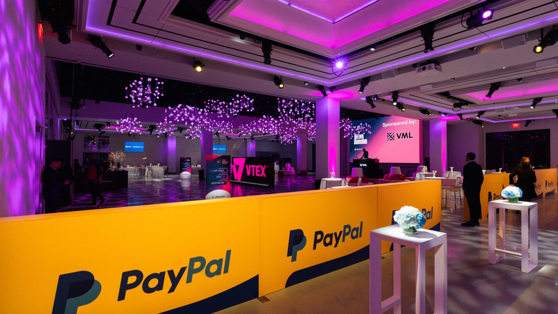
A brand environment is a room that argues for the brand without ever explaining it. The logo is not the point, and neither is the color palette. What a guest actually registers in the first ten seconds of a walk-in is material, scale, light, and the sense that the space was made for this company and no other. Good brand environment design earns that reaction with built decisions, not applied ones.
The failure mode is familiar to anyone who has worked a corporate load-in. A venue gets booked, a logo gets enlarged, a step-and-repeat goes up by the entrance, and the room stays exactly what it was before the truck arrived. The brand is present as a watermark on top of someone else’s architecture. Guests do not read that as confidence. They read it as a rental.
The alternative takes more work in the shop and fewer elements on the floor. It means treating the venue as a structural condition to answer rather than a backdrop to decorate, and committing to a small number of fabricated moves at real scale. The sections below are how our production team thinks about that work, from the first walkthrough to the last panel installed.
A Brand Environment Is Built, Not Applied
The distinction is not semantic. Branding applied to a room is additive and reversible in minutes: signage, soft goods, printed graphics, a gobo on the wall. A brand environment changes the shape, surface, and spatial logic of the space, which means it requires drawings, engineering review, a fabrication schedule, and an install crew who can sequence it.
That difference shows up in what the room can ask of a guest. Applied branding asks them to notice something. A built environment asks them to move through something, which is a far stronger instruction. Guest flow, sightlines, and the order in which surfaces reveal themselves all become design tools the moment the walls are yours.
It also changes who has to be in the room when decisions get made. Experiential event design and event fabrication cannot run as separate conversations here, because every brand decision is immediately a material decision. A finish that looks right in a render and cannot hold an edge under crowd traffic is not a design choice; it is a problem deferred.
The Architecture Speaks First
Every venue has an existing argument, and the fastest way to make a brand look weak is to stage a fight with it. Landmark interiors, glass pavilions, raw industrial shells, and hotel rooftops each come with a dominant material and a dominant proportion. The first job in brand environment design is to name those two things out loud, then decide whether the build will echo them or deliberately contrast with them.
Echoing is usually the stronger move for corporate work. For VTEX, a commerce platform, we built a brand immersion at The Glasshouses rather than a conference reception, with custom scenic fabrication in steel framing and industrial-finish surfaces that answered the venue’s glass-and-steel architecture directly. The scenic read as part of the building, which let the branded environmental graphics and dimensional signage carry the identity without shouting.
Contrast is the right call when the brand’s whole proposition is difference, and it costs more to pull off. A two-story walk-through house inside a landmark Italianate hall only works because the build is confident enough to be its own architecture; that is the logic behind the Barbie Dream House at Cipriani, engineered as a modular, self-supporting steel and wood structure. Contrast that reads as a mistake and contrast that reads as a statement are separated by finish quality and structural conviction, nothing else.
Either way, the decision has to be made before fabrication starts. Changing a material conversation at the test-fit stage means recutting panels, and recutting panels means the install window absorbs a delay it was never scoped to hold.
Graphics Belong at the Scale of the Room
The most common mistake in branded environments is treating graphics as print rather than as surface. A logo sized for a deck, blown up and mounted on a wall, looks like exactly what it is. Environmental graphics have to be composed for the distance at which they will be seen, the angle guests approach from, and the lighting they will sit under all night.
Large-format graphic environments work when they are part of the wall instead of a thing on the wall. At a private dinner at One World Trade Center, large-format graphic environments and laser-cut signage carried brand presence through a room whose defining feature was the view, which meant the graphics had to hold their own at low light levels without competing with the windows.
Three practical rules we apply to every graphic package:
- Size type for the sightline, not for the page. A wordmark that is legible at twelve feet and illegible at fifty is doing half a job.
- Decide the surface before the artwork. Painted scenic, applied vinyl, tension fabric, and laser-cut dimensional letters each change color, edge quality, and the way light falls across the same file.
- Reduce the count. One graphic moment at architectural scale beats six at poster scale, every time, in the room and in the photographs.
Dimensional work is worth the extra shop time wherever a graphic sits within arm’s reach. Cut letters hold a shadow, catch light on the return, and photograph with depth, while printed vinyl at the same size reads flat under a phone’s flash.
One Object Should Carry the Idea
Strong brand environments tend to have a single object that a guest could describe to someone who was not there. This is both a design discipline and a budget discipline, because it concentrates fabrication effort where it returns the most and lets the rest of the room do quieter work.
At One World Trade Center, that object was a hand-carved foam Earth suspended at the heart of the room, with custom-fabricated black acrylic dining tables built to read as monolithic surfaces beneath it and seating choreographed around the sightline. The centerpiece told the story; the tables kept the room coherent.
The same principle holds when the brand idea is atmospheric rather than literal. The seasonal transformation of Magic Hour into a mountain lodge on a midtown rooftop eighteen floors up turned on faux log cabin walls, shop-built and finished to read as timber from phone-camera distance, installed without modifying the rooftop. The décor wall of antlers, boots, ropes, and faux snow worked because the walls had already established the premise.
When every element competes for the hero role, nothing is the hero, and the recap deck ends up with twelve mediocre photographs instead of two that get used for a year.
Restraint Is the Hardest Discipline
The instinct on a branded event is to add. Another banner, another projection, another branded surface, because each one individually seems like free reinforcement. In practice each addition spends attention the room has a fixed supply of, and the best brand environment design is usually the version where someone had the authority to say no.
Lighting is where restraint pays the most visible dividend. For the Roivant holiday gala at The New York Public Library, the approach was layered light at human scale: warm downlighting on the tables, amber washes on the lower walls, and subtle uplighting that acknowledged the ceilings without trying to compete with them, with branded elements that honored the Beaux-Arts interior rather than overwriting it. In a building like that, the restraint is the design.
If a branded element cannot survive the question “what does this do that the room does not already do,” it should come out of the drawing set before it reaches the shop floor.
Restraint is also a reversibility argument. Builds that attach to themselves rather than to the venue, as drop-in components and free-standing structures, protect the client relationship with the venue and make strike a predictable overnight rather than a negotiation. Fewer, better-engineered pieces are easier to protect, crate, and reuse.
What the Shop Has to Solve
None of this holds up without a fabrication process that assumes the room will be photographed up close and walked through by hundreds of people. Three things decide whether a brand environment survives its own event.
Finish at the right distance
Every surface has a threshold beyond which a faux finish reads as the real material and inside which it does not. Scenic painting and faux finish work are specified against that threshold deliberately: a wall guests pass at six feet needs a different treatment than one they lean against at the bar.
Test fit before transport
Modular structures get assembled in the shop before they are crated, because a panel that does not meet its neighbor on a Manhattan sidewalk at 6 a.m. is a different problem entirely. Test fitting is also when the install sequence gets written and the labeling scheme gets set.
Install without a mark
Venue protection is a design input, not a site decision. Free-standing structures, standoffs, and floor protection are drawn into the plan from the beginning, which is what makes a build inside a landmark interior possible at all.
Brand environment design is ultimately a question of commitment: a venue either becomes an extension of the brand or it stays a venue with branding in it, and the difference is decided in the drawings long before the first panel is cut. If you are weighing a build like this for a corporate event, a conference, or an activation, the useful conversation starts with the venue, the brand’s dominant material, and the one object you want guests to remember. Get in touch and tell us what room you are working with.